
On 20 September 1976, the Brussels metro opened. For the first time, the M appeared at station entrances, a symbol that is now an integral part of the Brussels streetscape. A few months earlier, 1,200 Belgians had chosen Jean-Paul Emonds-Alt’s design as the official metro logo. But the M was far from the only contender. Even a mole was in the running. We delved into the STIB/MIVB archives, old newspaper articles and reference books to piece together the surprising story behind one of Brussels’ best-known symbols.
The first Brussels M dates back to 1969, not 1976
The story actually begins with the premetro, with trams running underground ahead of its conversion into a full metro system. On 17 December 1969, King Baudouin inaugurates the first section of Brussels’ premetro along the east–west axis. It comprises six stations between Schuman and De Brouckère. These stations needed a distinctive symbol of their own so that passengers could easily spot the entrances at street level.
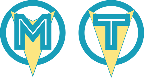
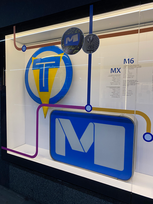
The logo consists of a blue circle, a large stylised M and a striking yellow arrow pointing downwards. In December 1969, this M sign stands at every station entrance, often mounted on a pole. One intriguing detail: the M is not confined to station entrances. A small version of the M symbol also appears on the front of the PCC trams running in the premetro.
Why Brussels’ M becomes a T in 1970
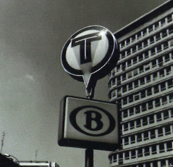
A year after the opening of the east–west axis, a second section of premetro beneath the ‘Small Ring’ road is ready to open. On 21 December 1970, STIB/MIVB brings an underground route of around two kilometres between Porte de Namur/Naamsepoort and Madou into service. Shortly before the opening, a surprising decision is made: the M, barely a year old, gives way to the T for tram.
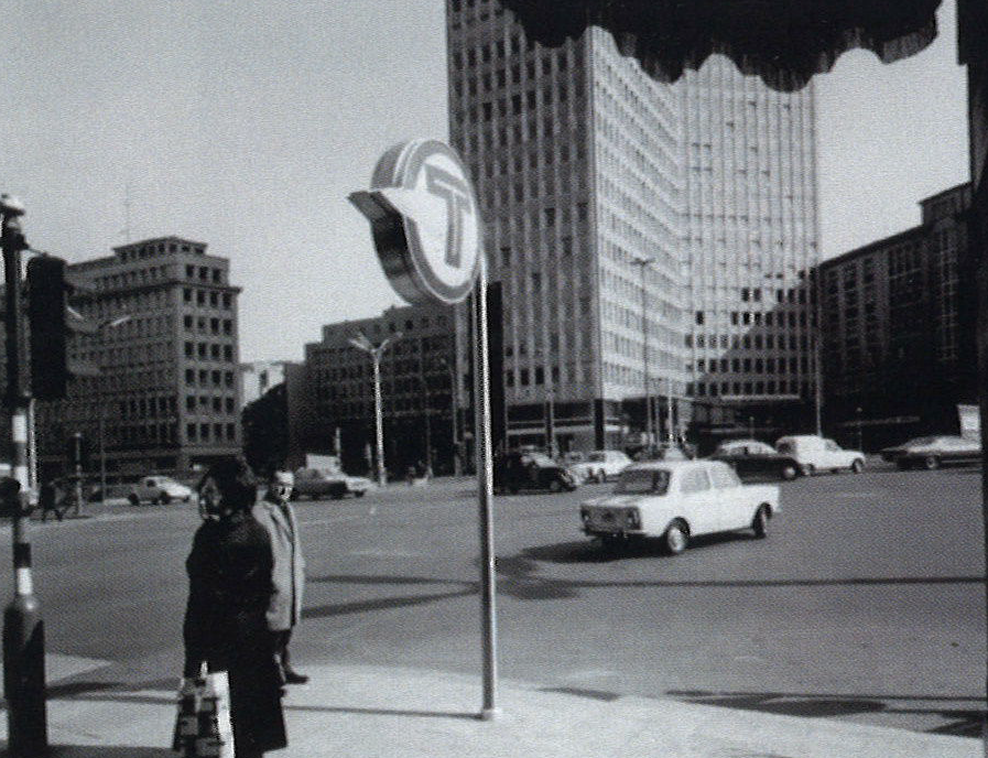
The design remains mostly unchanged. The circle and the large downward-pointing arrow remain, but now a T takes centre stage. Historical photographs show that the arrow does not always point downwards: it sometimes points left or right to indicate a station entrance further along the street.
So Brussels already has an M seven years before the first full metro service begins. But this M is short-lived, as former STIB/MIVB engineer Christian Dochy explains in his book “Les 50 ans du Métro de Bruxelles”. Barely a year later, it is decided that the letter does not accurately reflect what is running underground. After all, these are still trams.
Why Belgium looks for a single national metro logo in 1976
In the mid-1970s, everything changes again. The conversion of the premetro into a fully fledged ‘heavy’ metro is drawing closer. The national Ministry of Communications, back then responsible for transport, decides to officially inaugurate the Brussels metro on 20 September 1976. The route covers 11 kilometres, with a shared section between De Brouckère and Merode and two branches towards Beaulieu and Tomberg.
For the first true metro, a new logo is needed. The ministry therefore launches a national competition to design it. An article in La Dernière Heure dated 15 June 1976 reveals that the symbol is intended to mark metro entrances in “all Belgian cities that would have this form of transport”.
In true Belgian tradition, there are also plans to build fully fledged metro systems in Flanders and Wallonia, in Antwerp and Charleroi respectively. These are concrete plans: Antwerp’s premetro opens on 25 March 1975, followed by Charleroi’s on 21 June 1976. Neither ever becomes a true metro, but that is yet another story.
What requirements must the new metro logo meet?
Candidates entering the competition are not given carte blanche. Their designs must follow a set of rules. The new symbol must be simple, easy to recognise and clearly visible. Designers may not use red or green, as these colours could cause confusion with traffic lights and road signs.
Another striking clause in the competition rules states that the symbol must not be used on metro trains, timetables, network maps and so on. La Dernière Heure even drily remarks that this will presumably require another competition.
The new symbol therefore has a very specific purpose: to mark the entrance to a metro station above ground. No more, no less. The new M is not intended as a general logo to appear throughout the metro environment.
Even its physical positioning is regulated. According to the newspaper, its largest dimension must not exceed 95 centimetres, and the centre of the sign must be approximately three metres above the ground.
How did the competition for Belgium’s metro logo proceed?
The new metro logo is chosen in two rounds. First comes the national design competition, in which a panel of experts assesses five designs. The three with the highest scores go through to a public vote, with residents of 5 Belgian cities choosing the winner.
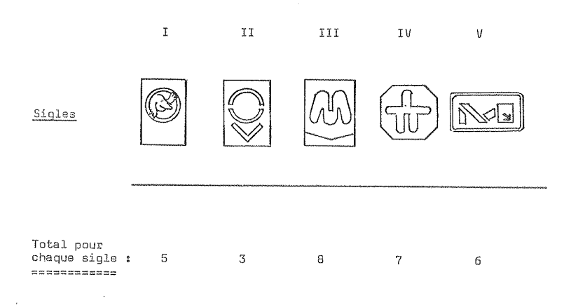
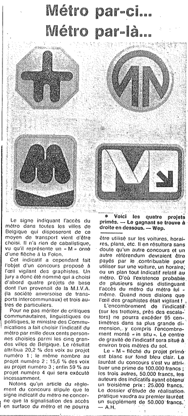
Five designs, among which … a mole
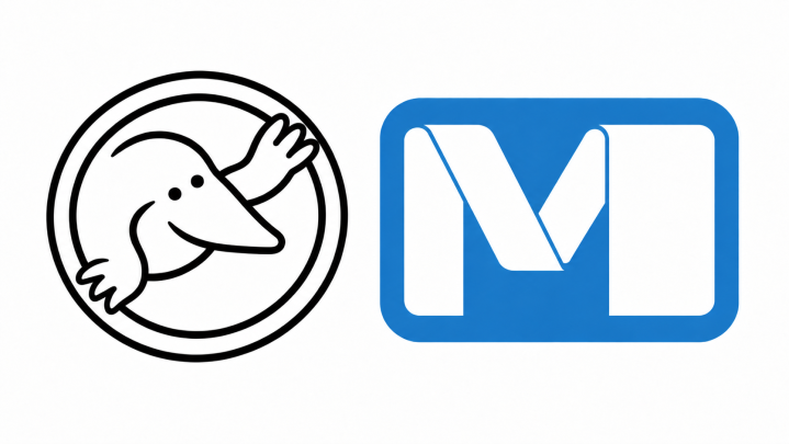
Design I immediately catches the eye. A mole! Most likely a metaphor for the metro, which, like a mole, travels underground through tunnels. It scores 5 points, not enough to reach the top three. We will therefore never know whether the idea behind the logo could have won over the public. As a mascot, it might well have enjoyed a successful career. The other logos score 3, 8, 7 and 6 points respectively. Designs III, IV and V go through to the public vote.
Antwerp gets a wild card
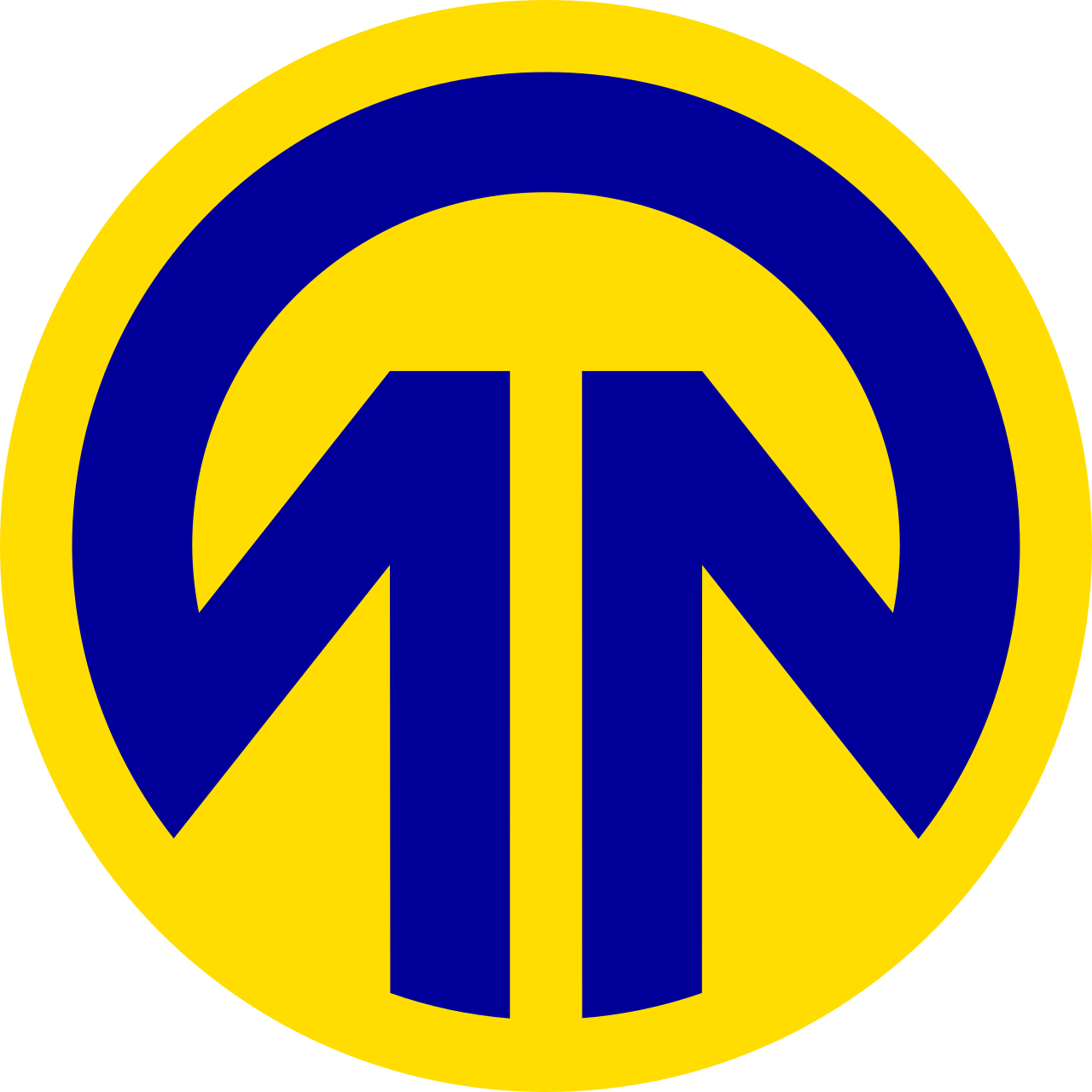
Then something unexpected happens. Next to the three selected designs, the ministry adds the Antwerp premetro’s temporary logo to the vote. We find nothing in the archives to explain how or why this decision was made. The Antwerp logo goes straight through to the public vote. Voters are therefore presented with four symbols: the three finalists from the competition and the blue and yellow symbol of the Antwerp premetro.
1,200 Belgians choose the winner
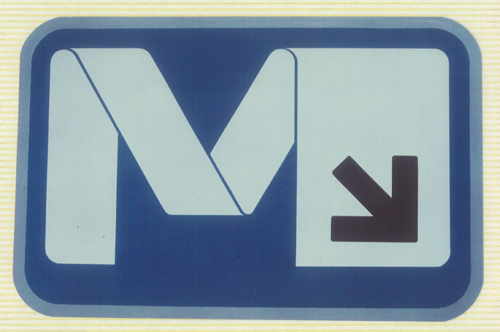
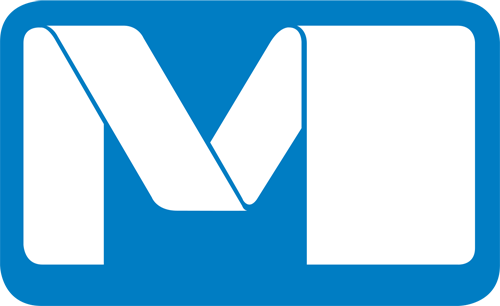
In the second round, 1,200 people from five major Belgian cities – Brussels, Antwerp, Ghent, Liège and Charleroi – are invited to express their preference. Jean-Paul Emonds-Alt’s design, which only comes third in the expert jury’s ranking, wins over the public. According to La Dernière Heure, an impressive 59 per cent of participants vote for it. A clear majority chooses the stylised white M on a light blue background, with a small arrow in the bottom right-hand corner.
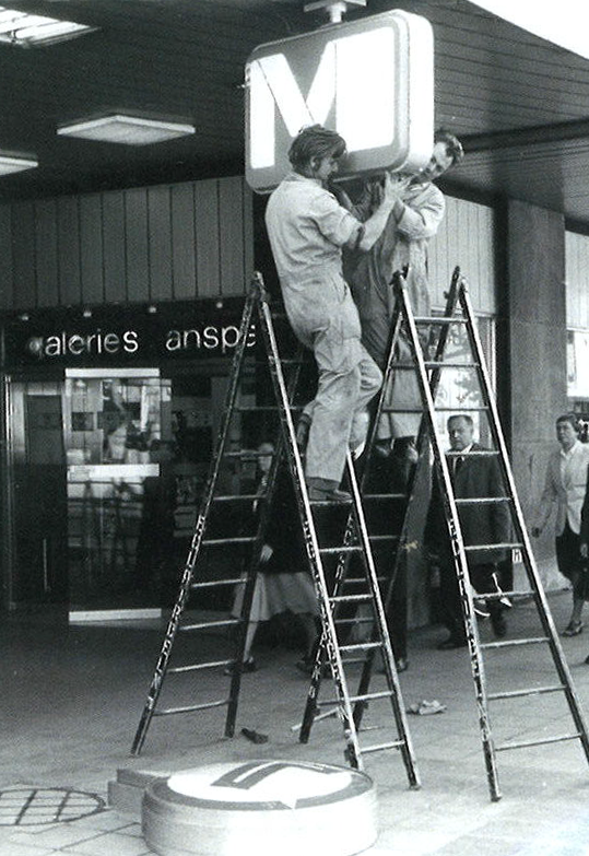
As the winner, Emonds-Alt receives 100,000 Belgian francs, with an extra 50,000 francs for the technical development of the design. A few days before the inauguration of the Brussels metro, workers replace all the Ts with Emonds-Alt’s M.
Who is Jean-Paul Emonds-Alt?
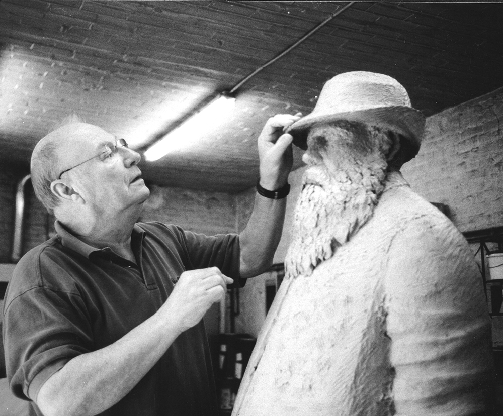
Jean-Paul Emonds-Alt is born in Etterbeek in 1928 and studies sculpture at La Cambre in the studio of Oscar Jespers, whose assistant he later becomes. From the 1960s onwards, he focuses mainly on design and the relationship between industrial products, form and their surroundings. He also teaches at La Cambre and at the art academy in Boitsfort.
By 1976, he is already an established name in Belgian design. His metro logo fits perfectly with the requirement of a simple form with a clear function. The sign is more than just a letter taken from a typeface.
It resembles a ribbon folded into an M, with one of its legs made wider. The result is simple enough to recognise from a distance and distinctive enough to look like nothing else.
Jean-Paul Emonds-Alt dies on 13 August 2014, aged 86.
Why was the arrow dropped from the winning metro logo?
The logo that wins in 1976 is not quite the design that hangs above our stations today. Emonds-Alt’s original design still features a small diagonal arrow in the bottom right-hand corner. We have been unable to establish when or why it was removed. Perhaps the M alone proved clear enough? Or perhaps someone felt the extra arrow was superfluous from a design perspective?
Why can we find this same M in Charleroi as well?
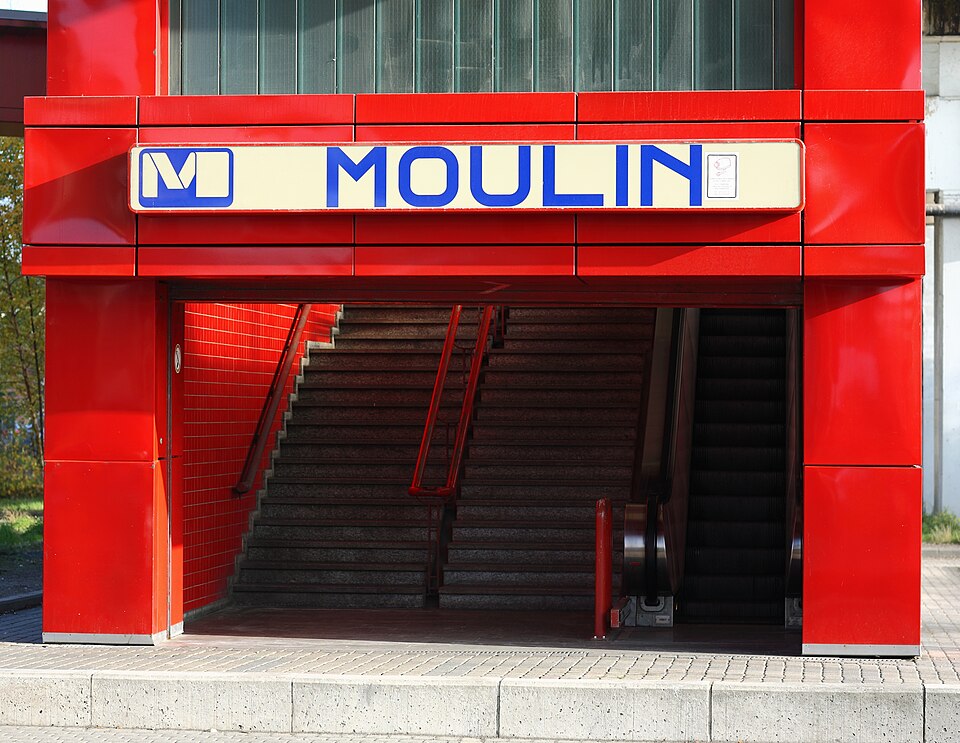
Emonds-Alt’s M also appears at the entrances to Charleroi’s ‘Métro Léger’. This is no chance copy of a Brussels logo: it fits perfectly with the national ambition behind the 1976 competition. Charleroi does not have a heavy metro system like Brussels. The Walloon public transport operator TEC officially calls it the Métro Léger de Charleroi, a light metro system served by trams. So Brussels got the heavy metro, and Charleroi the light one. The same M points the way in both cities.
Why did Antwerp choose another logo?
Antwerp goes its own way
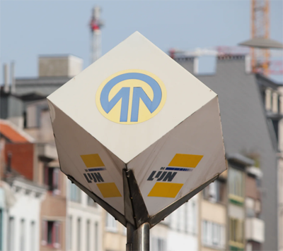
And then there is Antwerp again. The Antwerp symbol, added to the public vote as an extra candidate in 1976, loses the Brussels vote. But it does not disappear. Unlike Charleroi, Antwerp does not adopt the M. The yellow and blue premetro symbol remains part of the city’s streetscape.
This creates a paradox today. Although De Lijn itself now refers to the Antwerp metro, Emonds-Alt’s M is nowhere to be seen at its stations. Do the people of Antwerp realise they have a premetro rather than a true metro? Has the city nicknamed ‘Koekenstad’ ( ‘Cookie City’) succumbed to a rare bout of modesty?
From light box to digital totem
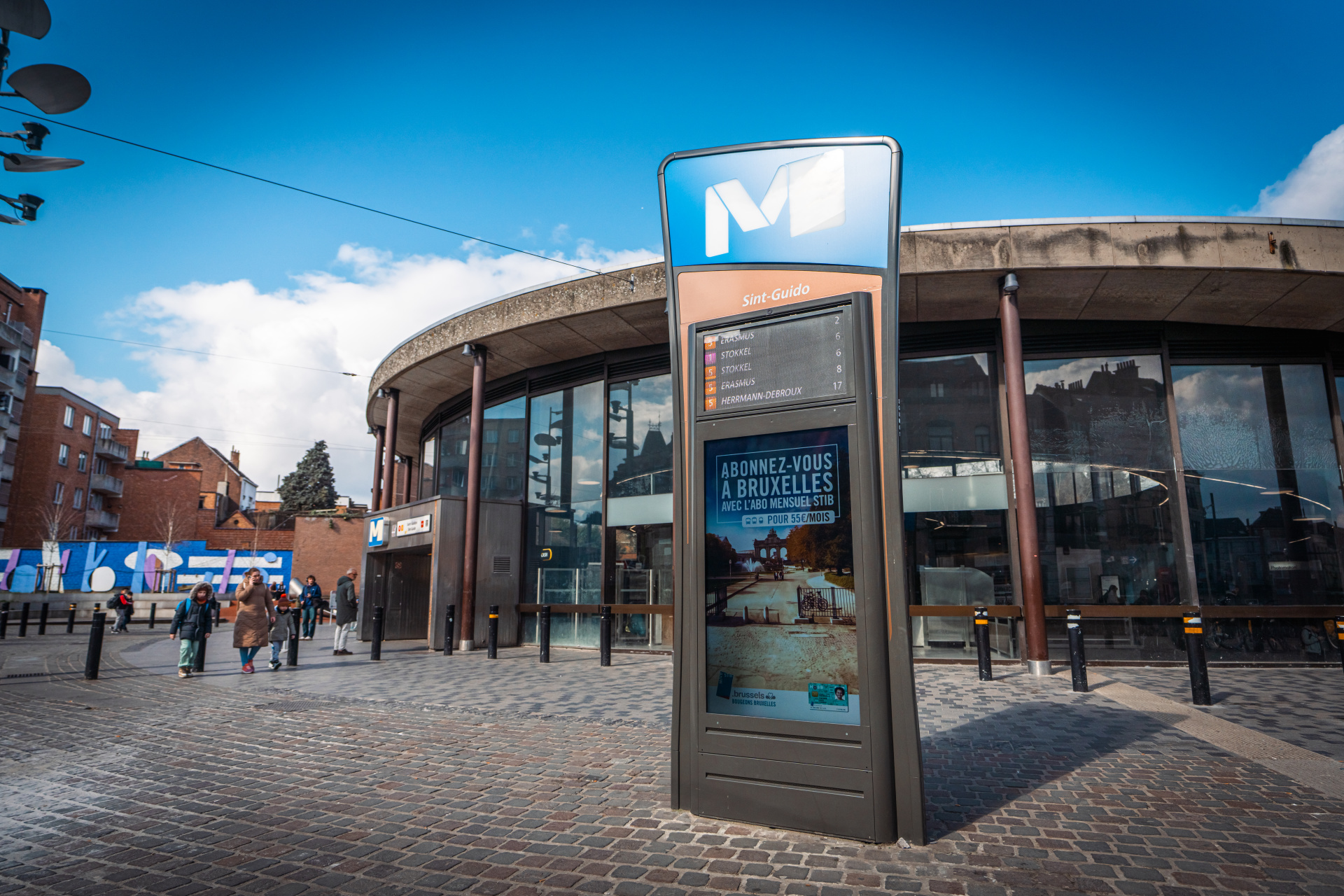
We return to Brussels, where the M has now been part of the streetscape for 50 years. For decades, it has appeared on the familiar illuminated signs at station entrances: simple lightboxes with rounded corners, displaying a white M against a blue background. The technology is simple; the symbol instantly recognisable.
In 2024, these familiar signs get a successor. A total of 130 new digital information displays, often called ‘digital totems’, begin to be installed at Brussels’ 69 metro stations, giving Emonds-Alt’s M a new home.
The rounded rectangle of the old signs gives way to a more irregular blue shape. Its organic outline draws inspiration from Brussels’ Art Nouveau heritage and echoes design elements found on the city’s buses, trams and metro trains.
The difference is mainly functional. The digital displays show waiting times in real time. On one side, passengers can also access an interactive journey planner, a street map and information about other transport options nearby. The content can also be updated remotely in the event of incidents or major events.
In 2026, the new signs receive a Red Dot Award for Product Design, an international design award recognising their appearance and integration into the urban environment. Not bad for an M that once came only third in the expert jury’s ranking.
FAQ
The logo was chosen in 1976, ahead of the opening of Brussels’ first full metro line on 20 September that year.
The well-known M was designed by Brussels artist and designer Jean-Paul Emonds-Alt. His design won a public vote in 1976 by 1,200 people from five Belgian cities.
A design featuring a mole was among the five proposals assessed by the expert jury. It received five points and did not reach the public voting stage. The public therefore never had the chance to choose the mole.
No. The competition had a national scope and sought a recognisable symbol for metro entrances in Belgian cities. This is why Emonds-Alt’s M can also be found in Charleroi.
Because it was designed specifically for that purpose. The competition rules stated that it should mark the above-ground entrance to a metro station and was not intended for use on metro trains, timetables or network maps.
Yes. The winning design included a small diagonal arrow in the bottom right-hand corner. It is absent from the current version. We have been unable to establish when or why it disappeared.